How do curved monitors influence color perception compared to flat ones?
I spend every day as a creator these days, and I run into this question often. I even consider myself to be a “pixel neat freak.” I’ve always been particularly sensitive to one question:
- Why does the same photo look different on a curved monitor and a flat monitor?
- Whose issue is this? The monitor or the eyes?
When you look at the pixels on a curved monitor, you actually don’t see a different colour output than on a flat monitor.The real difference comes into play from the curved shape when they are distributing light and adjusting the viewing angles. Those factors can trick our brain and mislead our eyes to make us see the colours differently.
Why Do Colors “Look Different” on a Curved Monitor?
Will editing my work on a curved monitor make the colours appear differently to someone with a flat screen?
Short answer: It actually will, but not for the reason you’re thinking of. The monitor itself does not change the colours, but you will.
(1) The viewing angle changes across the screen
When looking at a flat display, your eyes hit the entire display at the same angle.
When looking at a curved display, your eyes are at different angles. The edges of the display are pulled forward.
With good IPS panels, the difference in angles still causes:
- slight color temperature shifts
- contrast drop at the edges
- brightness falloff
- more visible dark-level differences
These changes are small…
But if you’re grading skin tones or fixing shadows, you’ll notice.
Curvature = Bigger Angle Changes = Bigger Color Shifts
Common curvatures:
- 1000R → strong curve (biggest impact)
- 1500R → medium curve
- 1800R–2300R → milder, safer for color work
The tighter the curve, the bigger the angle variance — especially at edges.
(2) Distance to your eyes isn’t uniform
Although curved displays attempt to follow the shape of your field of vision, the edges of the screens are still, by their very design, closer to your face than the centre of the screen.
That difference shapes your perception of the screen.
The human brain interprets:
- close objects as more illuminated
- curved edges as less sharp
That is why, in displaying the same shade of grey, the edges look lighter and less contrastive more than the centre.
(3) Light spreads differently across a curve
Curved panels distribute light unevenly:
- The center tends to look punchier
- The sides feel slightly washed compared to the center
- gradients can look smoother than they actually are
This matters when you’re doing:
- subtle dodging in portraits
- product color matching
- texture/detail retouching
- UI design with large flat-color blocks
How Do Curved Monitors Influence Color Perception Compared to Flat Ones
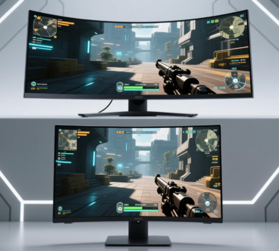
Hey, let’s be honest for a moment. When did all the curved monitors become such a phenomenon? Sure, it was for gaming, it was for multitasking, it was for work. But colour-critical editing? Definitely not the reason. So, yes. There *is* a conflict. And here it is.
- Curved = designed for immersion
- Color-accurate displays = designed for precision
(1) “Will a curved monitor make me misjudge color?”
Sometimes, yes.Especially:
- blacks & shadows
- skin tones
- neutrals & greys
- low-contrast gradients
- vignette perception
- edge-to-edge uniformity
If you need pixel-perfect color, curved screens introduce variables you can’t fully eliminate.
(2) “Will my teammates see a different result on their flat monitors?”
Probably.Your adjustments near the edges may look:
- darker or lighter
- warmer or cooler
- more or less contrasted
If your workflow depends on team consistency (agency work, brand work, product photography), that matters.
(3) “Will color calibration fix the issue?”
Calibration fixes accuracy, but not geometry. You can’t calibrate away:
- viewing angle differences
- curve-induced contrast changes
- eye perception bias
- edge falloff
Curved vs Flat — When Each One Makes Sense
| Task / Scenario | Flat Monitor | Curved Monitor |
| Color-critical photo editing | ⭐⭐⭐⭐⭐ Best | ⭐⭐ Not ideal |
| Video color grading | ⭐⭐⭐⭐ Better | ⭐⭐ Acceptable for rough work |
| 3D modeling, animation | ⭐⭐⭐ | ⭐⭐⭐⭐⭐ Best for immersion |
| UI/UX design | ⭐⭐⭐⭐⭐ Best | ⭐⭐ Risk of distortion & uneven perception |
| Multi-window productivity | ⭐⭐⭐ | ⭐⭐⭐⭐⭐ Fantastic |
| Gaming & entertainment | ⭐⭐ | ⭐⭐⭐⭐⭐ Built for it |
| Long hours/eye comfort | ⭐⭐⭐ | ⭐⭐⭐⭐⭐ Less strain |
When curved monitors shine
- Video editing with long timelines
- 3D modeling/sculpting
- VFX and node-based workflows
- Casual design & mixed tasks
- Multi-monitor replacement
- General office productivity
- Immersive creative work
Curved screens make everything feel more “wrapped into your world.”
When curved monitors are NOT recommended
- beauty/fashion retouching
- print design
- product color accuracy work
- brand guideline creation
- color grading for deliverables
- web/UI work that requires pixel consistency
- Any job where the client will judge color on a flat display
How to Pick a “Low Color Shift” Curved Monitor
Choose IPS, not VA
VA panels have a much worse angle-dependent color shift.
IPS minimizes the issue (though not fully).
Stick to gentle curves: 1800R or 2300R
The tighter the curve (1000R, 1500R),
the more noticeable the uniformity issues.
Look for “uniformity compensation.”
Brands like Eizo and some LG models offer this.
It helps even out brightness falloff.
Prefer 27–32 inches
Ultra-wide 34″+ increases curve distortion and viewing-angle issues.
Hardware calibration support (not software only)
- Dell PremierColor
- BenQ SW/PD series
- LG Ultrafine / UltraGear (high-end models)
- Eizo ColorEdge
Don’t rely on the edges
When you edit on curved screens, keep all colour-critical elements in the centre 50% of the display. This single habit prevents 80% of edge perception errors.
Conclusion
Here’s the honest, no-nonsense
1. Curved monitors do not change color data.
But they do change how your eyes perceive color — especially at the edges.
2. If color accuracy is your job, a flat monitor is still the safest choice.
Designers, photographers, graders, and retouchers need predictable uniformity.
3. Curved monitors are fantastic for productivity and gaming.
They’re more comfortable and more immersive — just not more accurate.
4. If you must use a curved monitor for color-critical tasks:
Choose IPS + mild curvature + factory calibration + Delta E < 2, and use a colorimeter regularly.
5.Two-screen workflow → One flat + one curved (the best combo)